Part 4: Using FastStore UI components
Get to know FastStore UI - a lightweight, performant, and ecommerce-ready component library.
Introduction
When developing your storefront project, you'll probably want to create your own components and use a UI library alongside. In this sense, and to speed up your development, FastStore already brings built-in components in a handy library called @faststore/ui. FastStore UI is one of the packages bundled in FastStore. It is a lightweight, performant, and ecommerce-ready component library. As an open-source project, you can also extend FastStore UI components to create custom solutions.
Let's now discover and use some of the components of FastStore UI.
Before you start
In this tutorial, you'll use FastStore UI. FastStore UI is already installed in your project and you can start using it straight away.
info
Both Gatsby and FastStore are not strict to any React framework. If you prefer, you can uninstall @faststore/ui and pick any React library of your preference. Unfortunately, many component libraries out there are not built with performance as a priority. Components are bloated and framework-dependent, leading to larger bundle sizes and loading times. That's why we highly recommend using FastStore UI.
Getting started with FastStore UI
FastStore UI library follows the Atomic Design pattern. Atomic Design breaks user interfaces hierarchically into smaller and simpler components. There are five distinct levels in Atomic design: atoms, molecules, organisms, templates, and pages. This is why you can see these terms as headers in FastStore UI Reference documentation. The image below can be used as a visual overview of how different UI elements are grouped together in Atomic Design:
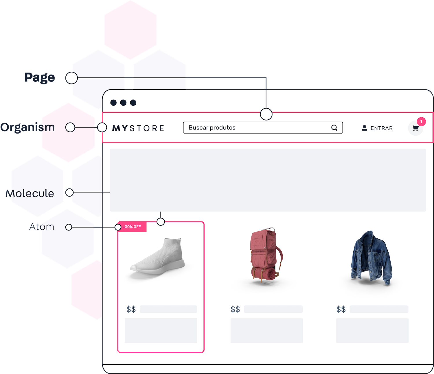
- Atoms are the smallest possible components, such as buttons, labels, icons, and badges. Atoms can't be broken down into smaller pieces without becoming completely useless.
- Molecules are simple groups of two or more atoms functioning together as a unit. As an example, take a Search component comprising a text input and a button with an icon.
- Organisms are relatively complex components that form distinct sections of an interface. Organisms can be composed of multiple molecules, atoms, and/or other organisms. For example, a Header component comprises a Search molecule, Logo atom and a list of links.
- Templates provide context and create relationships between these relatively abstract molecules and organisms through positions, placements and patterns of the pages. Templates don't render any component and are the skeletal structure of what a page would look like.
- Pages are specific instances of templates. They render what an interface looks like with real representative content in place.
The Atomic Design classifies components according to their level of abstraction and reusability. For example, a page is not reusable and does not appear more than once in an app. On the other hand, simpler components, such as atoms, molecules, and organisms may appear multiple times in the same app.
tip
Check the documentation of all components availalble in the FastStore UI here.
Adding components to the Homepage
Now that we are familiar with the structure of FastStore UI components, let's get back to our FastStore project and add a Carousel to the Homepage of our store website.
If you haven’t already, start a development server:
- Open the command line application.
- Change to your project directory.
- Run
yarn developto start a development server.- Open the browser and access your store at http://localhost:8000/.
Open your project in any code editor of your choice.
Open your Homepage file
src/views/home/index.tsx.Import the
ButtonandCarouselcomponents from@faststore/uito your Homepage./src/views/home/index.tsximport React from 'react'
import type { Props as PageProps } from 'src/pages/index'
import Seo from './Seo'
import { Button, Carousel } from '@faststore/ui'Create a new
divto present your carousel and some navigation buttons on your Homepage as in the following example:/src/views/home/index.tsxfunction View(props: Props) {
const title = props.data.site?.siteMetadata?.title ?? ''
return (
<>
{/* Seo Components */}
<Seo {...props} title={title} />
{/* Visual Sections */}
<div>
<div>
<h1>{title}</h1>
<div>
<Button>WOMEN</Button>
<Button>MEN</Button>
</div>
</div>
<Carousel
controls="complete"
transition={{
duration: 400,
property: 'transform',
}}
>
<img
alt="Nike"
src="https://images.unsplash.com/photo-1520316587275-5e4f06f355e6?ixlib=rb-1.2.1&ixid=MnwxMjA3fDB8MHxwaG90by1wYWdlfHx8fGVufDB8fHx8&auto=format&fit=crop&w=3570&q=80"
/>
<img
alt="Converse All Star"
src="https://images.unsplash.com/photo-1622540529856-6632540af089?ixid=MnwxMjA3fDB8MHxwaG90by1wYWdlfHx8fGVufDB8fHx8&ixlib=rb-1.2.1&auto=format&fit=crop&w=2340&q=80"
/>
</Carousel>
</div>
</>
)
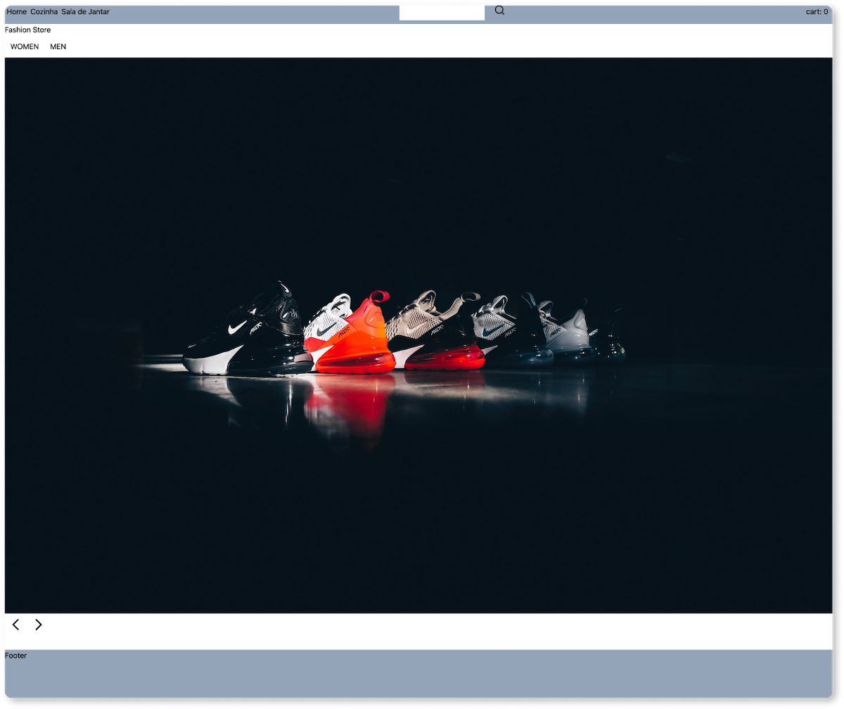
}By the end of this step, your page should look like the following image.
Now, you're probably wondering how to add styles and make this carousel section more visually pleasant. Don't worry; we've got you covered in the following part of this tutorial.